8 Web Design Mistakes You Need To Avoid Like The Plaque
All businesses have websites. If you run a business and you don’t have a website, you’re definitely heading in the wrong direction.
The goal of a website is to convert visitors into paying clients.
A web design that doesn’t do that is ineffective and wouldn’t yield you any customers—pretty much, a waste of your money.
From all the websites that I designed or influenced, clarity will always trump persuasion.
When someone lands on your website, they want to know two things:
-
Can I trust this service or product?
-
Is this for me?
Plain and simple!
I don’t care how aesthetically-appealing your website is or if your website was featured on https://www.awwwards.com/ (a well-known organization that recognizes the talent and effort of the best web designers, developers and agencies in the world), yup!
You see, the best website is a virtual salesperson who never sleeps, who works for you while you’re not paying attention and who answers all of your prospects questions.
To achieve this high standard, your content and design should be developed with the decision-making process of your target customer in mind, not you, not your business partner, not your marketing department and definitely not your CEO.
Website copywriting is a balance between art and psychology which, in turn, helps your website connect with your ideal audience, enhance your brand and optimize your search engine rankings.
As a website copywriter myself, I strive to write sharp and compelling content that connects with the soul and minds of the ideal customer with the one goal of helping said website drive real business results: sales & conversions.
Unfortunately, many new design features that you see on some of the well-renowned brands’ websites have been sabotaging their conversion rate rather than lifting it.
Now, here are the 8 common (and data-driven) design mistakes I see being repeated by some of the top web designers out there in the world wide web:
-
Using stock images as opposed to real business images, faces and people
I see this especially with health practitioners, like dentists.
They tend to use stock photos and I don’t know why the dentist or specialist doesn’t show their real faces.
If I am going to a dentist or any medical practitioner, I want to know who will be operating on me.
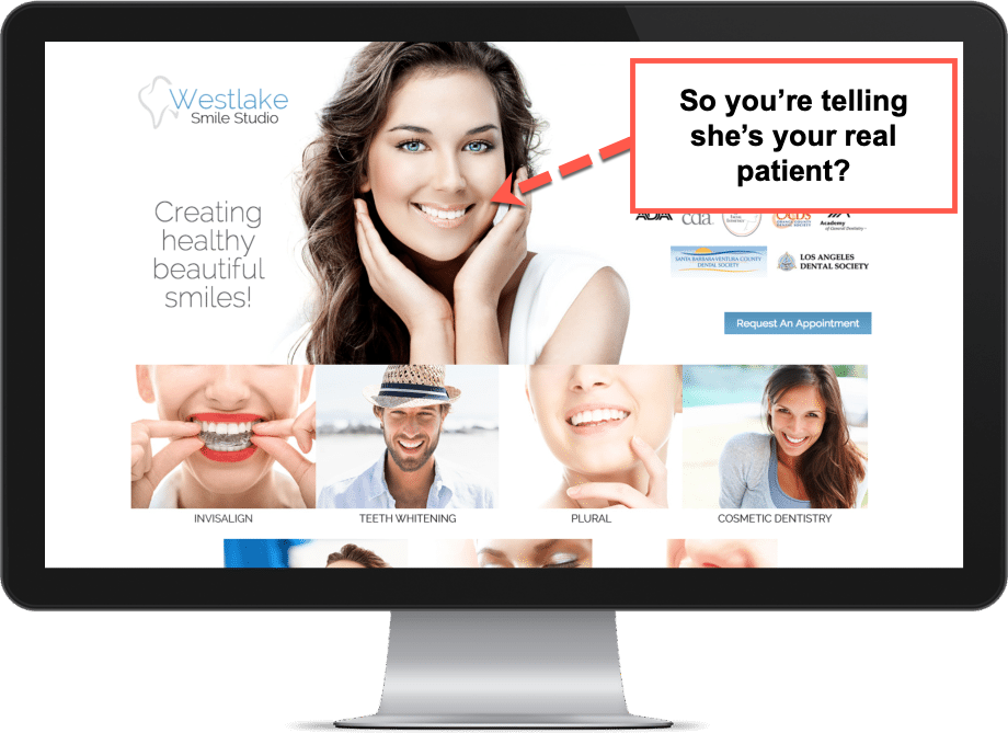
I want to see the team, I need to feel the vibe through real faces and real businesses.
There are so many A/B tests that have been performed, like the one by Visual Website Optimizer.
They proved that changing the image used on 160 Driving Academy’s home page from stock to real employee, resulted in 161% conversion gains for the truck driving school.
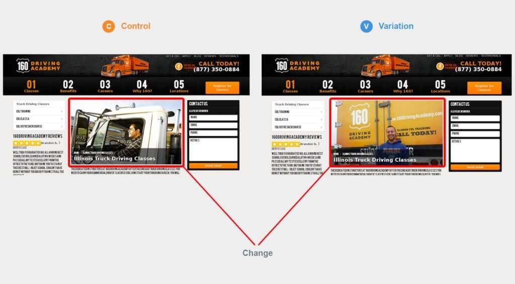
The focal point here is in selecting a relevant and unique image that is ideally not a “stock” image.
-
Trying to persuade to sell rather than provide clarity
This has been popularized by ClickFunnels, unfortunately.
(Nothing against them) but read any of their one page sales sites and you will get a premonition you’re being pushed hard to buy their products.
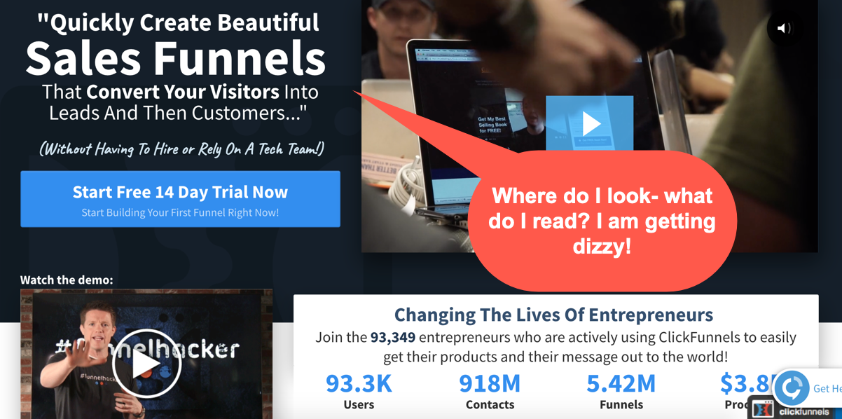
To me, it’s too salesy and tacky.
Clean and straightforward design is the future.
Too many colours, banners and EXTRA LARGE text doesn’t work anymore.
It’s like trying to shove so many ideas, colours and concepts down my throat at one go.
Doesn’t work as effectively on the sophisticated consumer nowadays.
When designing a website, choose one theme, one logo, and one typeface, and stay with them across all other aspects of your site.
For the love of God, don’t mix and match and stay consistent.
-
The dreaded homepage carousel
If there is one thing I would love to see eradicated from the face of the planet is the homepage carousel.
Just when you start fixating your eyes on one image trying to read the website’s value proposition- swoosh- just like that, it’s gone!
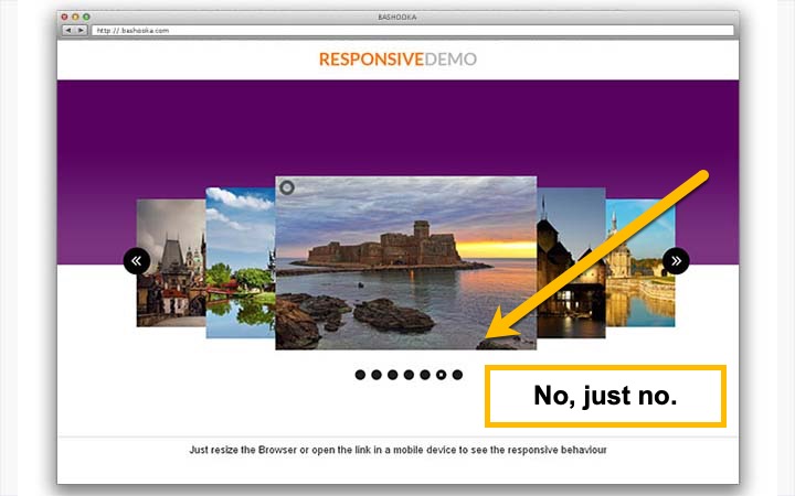
Neilson Norman Group has done numerous tests where they’ve clearly proven that carousels and accordions annoy the website visitors and reduce visibility.
Here is what they found out:
– Single-item visibility is reduced by having to take turns being on display.
– It’s just plain annoying for users to lose control of the user interface when things move around of their own accord.
– Because it moves, users automatically assume that it might be an advertisement, which makes them more likely to ignore it.
So if that’s not convincing enough, I don’t know what is.
-
Too little content
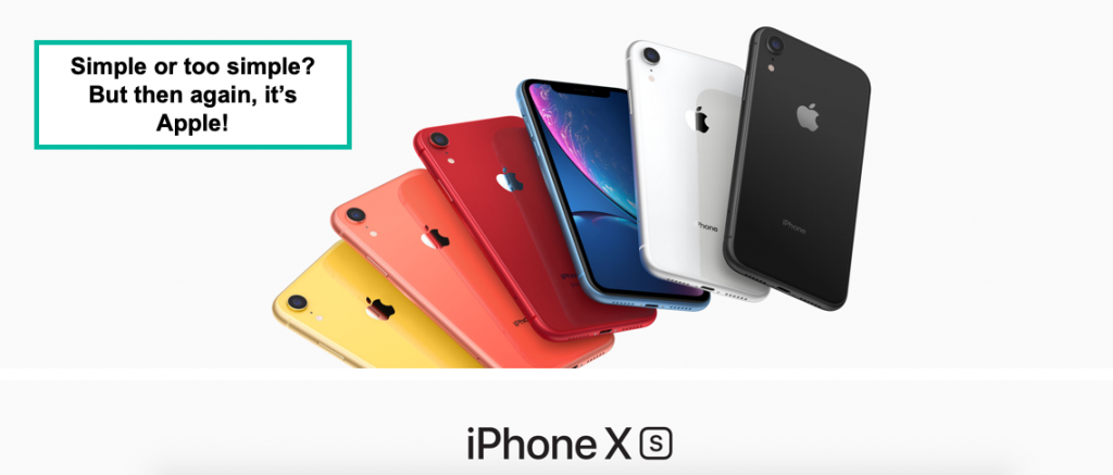
This is evident with mega brands like Apple and Coca-Cola.
The difference here is that Apple has thousands of people lining up on the launch of their latest cell phones, you don’t.
Coca-Cola has been in existence since January 29, 1892, your haven’t!
Visitors need to understand what your service or product is all about.
They need to know the benefit your product or service will have to enrich their lives.
One image and one liners might not suffice (no, they won’t suffice).
Matter of fact, visitors are not trying to decode your value here. It has to be clearly stipulated on your landing page.
Relying on simple images with no clear direction or content will leave your visitors guessing, and that will hurt your bounce rate.
A high bounce rate is when visitors navigate away from your website after viewing only one page— booking it faster than a horse running away from fire!
-
No or vague CTA (Call To Action)
A call to action button will guide your visitors to the next step you want them to take.
Learn more, submit and contact us are not specific enough.
Use action words that will tell your prospects exactly what you want them to do; here are good examples:
-
Get Your Free Proposal
-
Book Your Free Call
-
Schedule A Call With an Expert
-
Get Your PDF Report
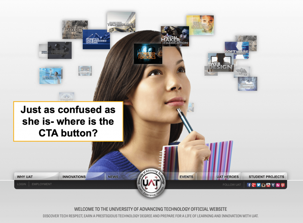
There should be enough information that visitors know what they’re going to get from the action they will be taking and the commitment they will be taking with you.
It’s a trust question.
Nonetheless, there’s a fine line between being helpful and being straight-annoying.
Make sure your CTA is concise and tells customers exactly what to do.
And please don’t use NOW and over do it with commanding them to take action.
I find it to be a little too pushy.
Just be specific.
-
Too much motion
I find this to be very common on the https://www.awwwards.com/ (a well-known organization that recognizes the talent and effort of the best web designers, developers and agencies in the world) website submissions.
Believe me, they’re cool but at the same time, they’re meant to be a piece of art just like that; nothing more, nothing less.
Branding is of course important and colour scheming is vital but adding motion to every block and slider on the page is just too dizzying and unnecessary.
Mind you, I haven’t found any research to show me that this type of website has a direct correlation to conversion rate lifting.
-
Confusing navigational menu
Deviant Art is one of my favourite websites to get inspired by yet I find the newly-designed site to be too confusing; in particular their navigational menu.
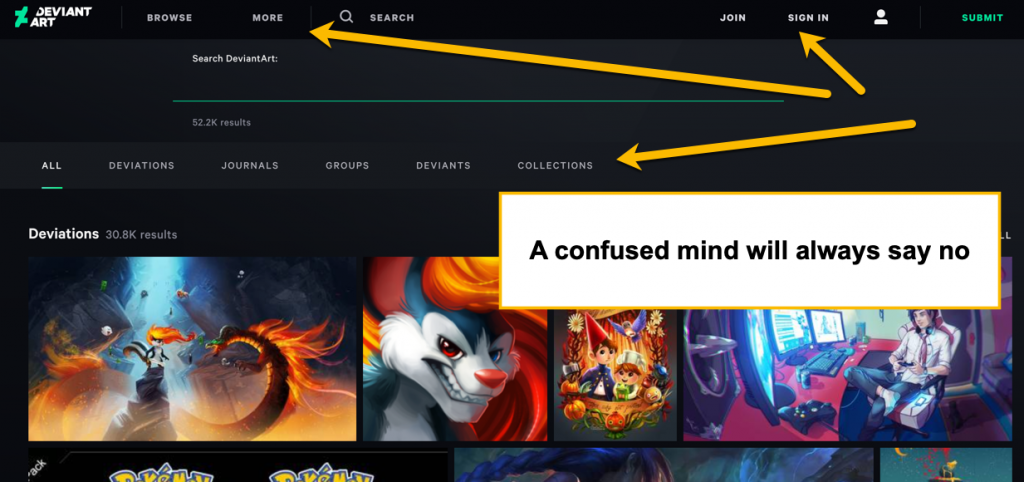
In the image above, you can see three navigational menus.
Which one should I click on first, especially if I am a first-time visitor.
The titles don’t make that much sense and are not very clear.
Deviations, journals, groups mean nothing to someone who is not familiar with the website’s structure and what it’s all about.
Remember what I said earlier, clarity will always trump persuasion with web design?
Well, now I say, a confused mind will always say no!
Don’t have more than 7 menu items. After all, short term memory holds only seven items.
With fewer menu items, your visitor has less options to scan over which means less decisions to ponder over.
Every time you remove a menu item, the remaining items become more prominent.
Try to keep it to six maximum is my advice to you— this is challenging for me too.
-
Mismatched pages designs
I’ve seen this with WordPress sites that have a couple of themes installed.
The web designer then selects whatever he or she chooses, thinking that each page is a unique entity.
Branding and consistency is what persuades people about your business and offerings.
Going back and forth between modern, corporate and boho-chic is not a consistent branding strategy.
Excessive creativity can be just that; too excessive!
No matter how unique and attractive a website is, if the overall look and feel is inconsistent, visitors will not understand it’s unique value proposition and may feel less in control.
To Conclude:
It is very evident that your web design determines whether visitors will read from you, engage with you, invest in any of your products/services or simply abandon you faster than a tornado abandoning a near-by city.
Keep it simple, stupid (K.I.S.S) and do your homework.
↓↓ Expert digital marketing that gets you more clients and more revenue ↓↓


